 During the 1970's to the mid 1980's David Hockney worked alot with photomontage. He used several polaroid snaps of one subject to make a composite image, like the one above. he took pictures from several anglesand at different times to replicate what a person would see in real life. this was later known as 'the joiners'.
Monday, November 2, 2009
David Hockney
During the 1970's to the mid 1980's David Hockney worked alot with photomontage. He used several polaroid snaps of one subject to make a composite image, like the one above. he took pictures from several anglesand at different times to replicate what a person would see in real life. this was later known as 'the joiners'.
Sunday, November 1, 2009
Amature stop-motion
This is an example of some more basic stop motion photography. the two guys have put together a good video showing some of the easy stuff you can do with stop motion.
Stop motion
Stop motion is the technique that photographers use togive the illusion that an object is moving on it's own. This works by taking several pictures of an object and moving them a small amount each time. When thes pictures are put into a sequence it gives the illusion of self movement.
Aardman studios use these techniques to create Morph and Wallace & Gromit (see video)
Thursday, October 8, 2009
Warming an image
there are many different ways to warm an image.
you can use the warming tool in the "create an adjustment layer" box.
you then set what colour you would like to use to warm the image
you then chose how much you would like to warm an image, using the drag tool.

warming blue 80%

warming green 80%

warming orange 80%
you can use the warming tool in the "create an adjustment layer" box.
you then set what colour you would like to use to warm the image
you then chose how much you would like to warm an image, using the drag tool.

warming blue 80%

warming green 80%

warming orange 80%
David LaChapelle
David LaChapelle is a photographer and video/commercial/film director who works in the fields of fashion, advertising, and fine art photography, and is noted for his surreal, unique and often humorous style.
He works not only in the photograpy industry but he also make music videos for artists all over the world.
LaChapelle has produced 4 books of his photography, of which, all ofthem contain photos of famous people, including David Beckham and Angelina Jolie.
Here are some ex amples of his work.

 amples of his work.
Hue & Saturation
 For hue and saturation I chose an image that had the potential to show a lot of colour. I decided on this photo because I thought that graffiti would come out quite bold after i had played around with it.
When i had the image in photoshop i made another bachground layer so that i could alter specific parts of the picture.
I did a magnetic lasso around one of the parts of graffiti, I then opened up the "hue & saturation tool".
I adjusted the hue to "+15" and the saturation to "+45", I decided to leave the lightness alone for this image.
This is the final image, i also am showing an image of what the picture would have looked like if you do too much hue or saturation or both.
As you can see the image has become compleatly drenched in colour and looks dramaticly different.


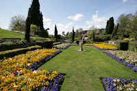
Using Levels
 This is the image that i chose to adjust the levels to.
Firstly i selected the lake by using the "magnetic lasso tool".
Then i selected the lake.
then I on the layer i had just created I went to "levels" and made the lake a little bit brighter.
A histogram shows how much of the red grre and blue is in an image. you use one to make an image brighter.
If the image was correctly exposed then the histogram would be central in shape.
If the image was over-exposed then the image has too much light in it and the histogram will be uneven, with more of it being light.
If the im gae is under-exposed then the histogram will be uneven with to much darkness in it.
This is te final image after i have sorted out the levels.

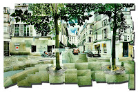
Cropping tool
 This was my origonal image. it had so much green around the outside and there was quite a lot of space around the left hand side and the right hand side. I decided to remove this space from the photo using the cropping tool.
 This is the newly cropped image. As you can see I have taken out the space on the right and left of the image. I aslo decided to remove some of the tree line at the top of the image to frame the picture better.
Filters
 This is the image that I used to change the filters. There are a lot of different colours in the image itself so I took this into consideration when I decided what filters to use.
Main image


The first filter i used was the "cutout" filter. This made the colours from the image stand out, you can see from the print scree that I changed the number of levels and the edge simplicity.

This was the next image that I added a filter to, i used to "liquify" tool under the filters to distort the photo. This has quite a dramatic effect on the picture. The liquifying is done manuly so you can choose what sections of the photo you want to filter out.

 For this image i used the "stained glass" filter option. you can see from the other image that I had to change the "cell size", this ment the size that each part of the "stained glass" effect. I also had to change the light intensity of the picture, this is used in the amount of light that was in the main part of the image.
for this image i used a different image. The image I used was quite grainy to start off with and i tried to sort the levels and saturation out before I filterend the image
Subscribe to:
Comments (Atom)